




Choosing Between Debossed & Foil Stamped Logos on Microfiber Pouches
When customizing microfiber jewelry pouches, the logo finish plays an important role in how the packaging looks, feels, and represents your brand. Two of the most common logo options are debossed logo and foil stamped logo.
Both finishes can be used on microfiber jewelry pouches, but they create very different effects. Debossing focuses more on texture and subtle detail, while foil stamping creates a more visible and decorative logo finish. For jewelry brands, boutiques, and wholesale packaging buyers, choosing the right process depends on brand style, product positioning, and the way the packaging will be used.
What Is a Debossed Logo on Microfiber?
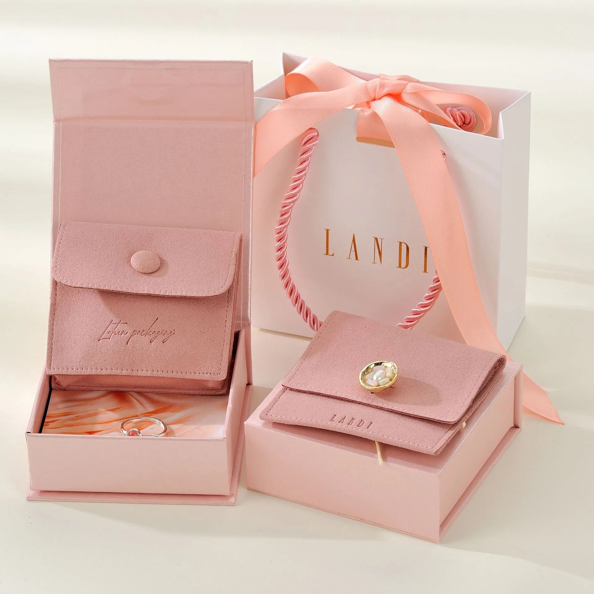
A debossed logo is created by pressing the logo design into the microfiber surface. Instead of adding color, the logo appears through depth, shadow, and texture change. This is why it is often used as a colorless logo finish.
On microfiber jewelry pouches, debossing creates a soft and understated branding effect. The logo does not strongly stand out from a distance, but it becomes more noticeable when viewed up close or touched by hand. Because microfiber has a suede-like texture, the pressed logo blends naturally with the material and creates a clean, refined look.
This makes debossing a good choice for brands that prefer minimalist, quiet, and premium packaging.
What Is a Foil Stamped Logo on Microfiber?
Foil stamping applies a thin layer of metallic or colored foil onto the microfiber surface using heat and pressure. Common foil colors include gold, silver, rose gold, copper gold, black, and other single-color finishes.
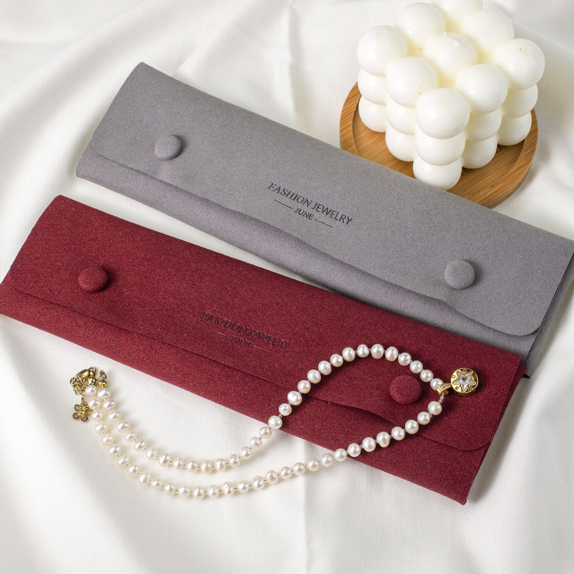
Compared with debossing, foil stamping creates a more visible logo effect. The logo reflects light and stands out more clearly against the pouch material. This makes the branding easier to notice in product photos, retail displays, gift packaging, and social media content.
Foil stamping is often used when a brand wants the logo to become a stronger visual element on the packaging.
Main Difference: Texture or Shine
The main difference between debossing and foil stamping is how the logo is noticed. Debossing creates a subtle logo through pressure, depth, and texture, while foil stamping adds a visible layer of metallic or colored shine.
One feels quiet and refined; the other looks more decorative and eye-catching. This is why debossing is often chosen for understated luxury packaging, while foil stamping is better for brands that want stronger logo visibility.
When to Choose Debossed Logo
Debossed logo is especially suitable for brands that want a clean, high-end, and timeless packaging style.
It works well for fine jewelry brands, minimalist jewelry packaging, neutral-color microfiber pouches, and daily retail packaging. If your brand uses beige, gray, black, brown, or other muted-tone pouches, a colorless debossed logo can keep the overall look soft and balanced.

Debossing is also a good option when the material texture should remain the focus. Instead of adding extra color or shine, it keeps the pouch surface simple while still giving the packaging a customized and branded detail.
For best results, debossing usually works better with simple logos, clean lettering, initials, or bold brand marks. Very thin lines or highly detailed artwork may not appear as clearly as they would with foil stamping.
When to Choose Foil Stamped Logo
Foil stamping is a better choice when you want the logo to be more visible, decorative, and easy to recognize.
It works well for gift-ready jewelry packaging, bridal jewelry brands, holiday packaging, boutique retail displays, and premium product lines. Gold foil, rose gold foil, and silver foil are especially popular for jewelry packaging because they match the polished feeling of jewelry itself.

For example, a gold foil logo on a dark microfiber pouch can create a rich and elegant look, while silver foil on a light or cool-toned pouch can feel clean and modern. If the pouch will be photographed, displayed in-store, or used as part of a gift set, foil stamping usually gives the logo stronger visual presence.
Foil stamping is also suitable for brands that want the packaging to feel more finished and decorative, especially when the logo is an important part of the visual presentation.
A Few Details to Consider Before Choosing
Besides brand style and usage scenario, pouch color and logo design can also affect the final result.
Foil stamping usually creates stronger contrast on darker microfiber colors, especially with gold, silver, rose gold, or copper gold foil. Debossing works better when the goal is a softer, more natural look, especially on neutral or muted pouch colors.
Logo design also matters. Debossing is more suitable for simple logos, clean lettering, initials, and bold brand marks, while foil stamping can make the logo more visible when stronger contrast is needed. For very small text, thin lines, or complex artwork, the logo may need to be adjusted before production.
Which Logo Finish Should You Use?
Brands looking for a soft, minimal, and understated packaging style will usually be better suited to debossing. Since the logo is pressed into the microfiber rather than placed on top of it, the finish keeps the pouch clean, texture-focused, and refined. This makes it a strong choice for fine jewelry, minimalist brands, neutral-color pouches, and everyday premium packaging.
Foil stamping works better when the logo needs to be more visible and decorative. Metallic foil colors such as gold, silver, rose gold, and copper gold can help the logo stand out in product photos, retail displays, bridal collections, holiday packaging, and premium gift sets. It gives the pouch a more polished and gift-ready appearance.
In short, the choice depends on what kind of brand impression you want the pouch to create. Debossing gives your brand a soft, refined, and detail-focused image. Foil stamping creates a brighter, polished, and easily recognizable brand presence.
—Have an idea in mind?
Contact us to bring it to life at support@siliice.com.


